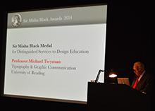
The Sir Misha Black Medallist’s Address
Professor Michael Twyman
Department of Typography & Graphic Communication
University of Reading
“Thank you Mary Mullin and Professor Malcolm Garrett for those generous words.
My thanks also go to those who proposed me for this award, and especially to the Sir Misha Black Awards Committee for honouring me with its splendid medal. I am flattered, privileged, and indeed overwhelmed to be the recipient of the Sir Misha Black Medal for 2014, and to find myself among such an august group of past Medallists and sharing this occasion with The Sorrell Foundation.
Given recent events, bonus may not be the right word to use, but in the general and traditional sense of the word that is what it is. It is extra to what I have gained from a career in design education, and also extra to my expectations. I count myself blessed to have been able to follow a career that, overall, has brought me so much pleasure and fulfillment – and, in passing, an education for myself.
To receive the Sir Misha Black Medal at this stage of my career – and who knows what lies ahead – is especially rewarding because it comes from my peers. I accept it with gratitude and with acknowledgements to the contributions to the course at Reading made over the years by many remarkable members of staff and by numerous talented and committed students.
On the very day I received notice of this award I had been running one of my regular sessions with postgraduate students at Reading on perhaps the most heroic figure of twentieth-century typography, Jan Tschichold. I had set out in the form of a time line, a selection of work, mainly original items, that Tschichold had designed. At the beginning was a calligraphic book, very much in the arts and crafts tradition, which he produced in Leipzig in 1919 when just seventeen years old. There followed several publications of the 1920s in which he displayed the robust modernism for which he was blacklisted by the Nazi Party in Germany. The next group of items, designed in the 1930s, revealed a toning down of some of his modernist ideas. Then, from the late 1930s, came a reversion to traditional centred typography and serifed typefaces that was to be his approach thereafter. The final item I showed – marked-up proofs for a book he designed – was produced in the year of his death in 1974.
For those here who are not typographers, I should say that many of Tschichold’s contemporaries, including Max Bill, a previous winner of this medal, felt that he had betrayed his modernist ideals and compromised his earlier principles when he reverted to what might today be called ‘traditional values’.
The reason for my reporting on this is that I asked students at the end of my two sessions (two because I repeat the classes) whether they thought it was a sign of strength or of weakness to have changed direction as Tschichold had done. I gave no leads. To my surprise both groups (ranging in age from, I suppose, twenty-five to forty, and from all over the world), and unanimously as far as I could tell, felt that the changes were a sign of strength.
Since the only condition made for the award I am honoured with today was that I should talk about my work and my ideas about design, I have been prompted to compare that student view with my own career. Had I changed my ideas about design? I am not in any way comparing myself with Jan Tschichold, a towering figure in twentieth-century typography; the only point of the comparison is that I too have had a career spanning over fifty years in the world of typography.
To start with, I have had just one job in one place. Is that a sign of strength or of weakness?
As to whether I have changed my ideas about typographic design over these fifty years I decided to find out. Curious though that may sound, it was not at all difficult because, in 1970, I gave an after luncheon talk to the Wynkyn de Worde Society in Stationers’ Hall called ‘Typography as a university study’ – which was subsequently printed for members of the Society. Here it is: my only visual aid this evening.
With this occasion in mind, I turned to see what I had said. The talk raised matters of both education and design, though in my view there is a considerable overlap between the two. I opened with these exact words ‘Education is not fundamentally about courses, syllabuses, teaching methods, and so forth, but is concerned with the interaction of people and the sharing of interests and experience…’. Given the educational climate in Britain today, I would now have to add ‘testing’, ‘targets’, and the associated bureaucracy to my list of things that have distracted us from the essentials of education – indeed, they would have to be in bold type. On such things, my ideas have not changed, I believe that a teacher’s prime task, at least in my sector of education, is to encourage students to learn for the rest of their lives and to provide them with the essential means of doing so.
In 1970 I must have felt the need to make my position clear, because I did indeed go on to say something about the nature and structure of the new course at Reading – the details of which you will be spared, except from my saying that from the outset, alongside with practice, it included studies in computing, linguistics, perception, and the history of the subject (all taught by specialists).
What I pass on today, almost word for word, are the four basic beliefs that I set out as underpinning the course:
1. that typography starts with the need to communicate something, and that the resulting visual form of the typography should reflect and reinforce this requirement;
2. that typographic designers must have a general understanding of the technical means at their disposal;
3. that the needs of the reader (the user) should be respected and, in so far as we know what they are, should be central when designing.
4. that typographic design involves planning in relation to these three considerations, and usually in the context of a client, an industrial organisation, a budget, and a deadline.
Though I might express myself differently today, I find no reason whatsoever to change these basic beliefs: indeed they now appear rather orthodox, even embarrassingly banal. All I can say in self-defence is that they were far removed from the prevailing thinking in the educational world at the time, and were regarded by many as severely restricting creativity – an argument I used to counter by citing the innovative twentieth century composer Stravinsky: ‘the more constraints we have, the more we free ourselves’.
I went on to flesh out some of the means by which the above aims might be achieved, and began by stressing the value of some aspects of a traditional university education. I would have done this, wouldn’t I? After all, the other British courses in design at the time, apart from the one here at the Royal College of Art, were based in art schools, printing schools, or the growing group of polytechnics. But this was not a comment about the nature of institutions, more about, as I put it, ‘the value of writing essays, preparing for seminars, and opportunities to work and browse in a good library.’ These activities, I continued: ‘help to create a respect for language and learning, and encourage precision of thought and expression, which are essential for a typographer’. These, then, were the arguments I put to support my first belief, that typography starts with the need to communicate something to others.
I supported my second belief (that typographic designers need to understand the prevailing means of production) with comments that are now both embarrassing and revealing. The embarrassment stems from the very modest technological beginnings of the course at Reading, which had grown out of the arts and crafts tradition. We were so deficient on this front at the outset that the local printing school was persuaded to offer us classes on industrial print production. As it happens, this was a good experience on many accounts, as those with a broad understanding of the fault lines that exist between eductional sectors will appreciate.
Our flourishing Department of Agriculture at Reading, which ran farms as a support to teaching and research, led me to realise that it was sensible to link learning about typography to a functioning and, as it happened, constantly changing printing workshop. What subsequent developments in graphic technology have revealed, however, is that though such changes may have an impact on procedures and end products, they rarely change the essentials of design thinking.
The third belief, understanding and respecting the needs of the reader, would now be called ‘user-centred design’ – and doesn’t that ring a few educational bells too? In fact, student-centered education and user-centred design have a great deal in common, they focus on the needs of what – for want of a better word – might be called the recipient, or even participant.
The fourth belief, that design is usually undertaken in the context of a client, a budget, and a deadline, was tackled by finding live design assignments for students. This ruffled some professional feathers, but without actually practising design in a context with a client how do you foster an understanding of designer-client relations, or the need for clear production specifications, teamwork, good procedures, and a respect for deadlines?
These four core beliefs are, in my view, as valid now as they were in the 1960s. Hollow though the notion may sometimes sound, the designer, in whatever field, does, or at least should, serve the needs of society in some way. And these four beliefs provide – for me at least – the essential underpinnings for doing so in typography and graphic design.
You will have noticed that up till now I have not referred to ‘graphic design’, which was, and still is, the term used to describe much of what I have referred to. I shall explain why. In the 1960s graphic design education seemed to lack boundaries and a focus, which is why I and some others felt that typography should be considered its core discipline. After all, not much graphic communication takes place without any words at all.
In any case, a new course required a distinctive name, and the ampersand that links Typography with Graphic Communication (as on the screen at the moment) was meant to signify that the two were inextricably linked – as strongly as Victoria and Albert were to be in Alan Fletcher’s brilliant V&A logotype of 1989.
What I have said so far has been concerned with the establishment of the course at Reading. I am not given to talking about myself or my own work, but I should perhaps say that I was trained as an artist and took a degree in Fine Art at, of all places, Reading University. My choice of Reading ran counter to the career guidance given to me at school by art inspectors, who advised me to go to what was then called St Martin’s School of Art. Who knows whether I made the right choice, or whether St Martin’s would even have accepted me?
I should add that the design world I had been brought up in at school in Walthamstow in the late 1940s and early 1950s was one that Misha Black and Milner Gray’s Design Research Unit had begun to shape. And in Walthamstow I could hardly escape the influence of William Morris.
For the first two years as a student at Reading University I did what was routine at the time: a lot of drawing, some painting, sculpture, and printmaking (plus classes in anatomy, perspective, lettering, heraldry, aesthetics, and art history). Peculiar to Reading was that we took two other subjects for a couple of terms. After that I specialised and focussed on printmaking and typography, my real love being lithography, which I have written about extensively. Though I have always regarded this as a pretty serious research activity, my accountant rather endearingly brings me down to earth by insisting on referrring to it as my ‘hobby’.
Already as a student I had begun practising at a modest level as a typographer, with local clients. Nevertheless, it seemed that I was destined for a career as a schoolteacher and, after graduating and one year as a research student, I followed an education course at Cambridge. Then, much to my surprise, I was invited back to teach in the School of Art of the University. That was in 1959, the very year in which Sir Misha Black took up his appointment here at the Royal College of Art. At Reading I taught a bit of everything for a while, but my focus was supposed to be something called design (though I recall that the sign over the door read rather menacingly – and most misleadingly – ‘Typography and advanced book production’).
I am not sure that anyone knew what design was, and I certainly did not. Like many others I learned on the job. I think I was fairly well informed about typography and printing, but had really no idea of what was meant by design, or indeed how to teach it. But after a few years in which I went out of my way to practise as a typographer, partly for financial reasons, but also to gain experience, I realised that this rather cosy craft-based approach to design at Reading, valuable though it may have been, was not enough. Particularly, I thought, in a university context, where there were so many opportunities to explore.
My learning experience came through practice and by reading about design in other fields, particularly architecture; but it was enriched by contacts with graphic designers and people in the printing and related industries who had given some thought to education. Eventually I was put onto what was called the joint Working Party on Typographic Teaching, which had been set up by the Society of Industrial Artists and Designers (now the Chartered Society of Designers) and the Society of Typographic Designers. This working party was the brainchild of Ernest Hoch, a highly intelligent, perceptive, and socially conscious graphic designer. Surprisingly, by the middle of the 1960s I found myself chairing this group and in 1968 seeing through a report on the teaching of typography. In this context I met and worked with graphic designers and teachers of design who, like me, felt that something needed to be done to improve education in the field at all levels and in many kinds of institutions.
By 1965 I had proposed a course much along the lines of the one that was later established at Reading. Not surprisingly, the ideas it embodied were seen as anathema to a community of artists, by this time bouyed up by the success of the art scene in Britain. What I had learned about design was simply seen by those responsible for me – line managers as they would be called today – as compromising artistic principles and selling ones’s soul to the commercial world. Outside, in the real world, people in the printing industry told me that we would not be able to attract students as no one would know what typography was. For me this was a particularly bruising period and I learned to defend what I had come to believe in, and also something of the art of university politics (an art, I am happy to say – and indeed have to say as my Vice-Chancellor is here – I have lost entirely). That the course was eventually introduced owes a lot to supportive people in the most senior roles in the University, who must have seen some value in what was being proposed. To my great regret, not one of them is still alive to learn of this occasion.
For young people here I should explain that we are talking about a period before the introduction of degree courses in design, when letterpress printing was still flourishing commercially, before the introduction of computer-controlled typesetting, and a decade or so before the first primitive desktop computers.
Things have moved on, and we are now in an entirely different world. To my great delight Typography at Reading has gone from strength to strength, and despite enormous pressures of the kind I need not spell out, the kind of teaching and research introduced in the 1960s continues. The beliefs I outlined at the outset do not in themselves prescribe a course. This developed in the hands of a staff that included, and still includes, designers and scholars of international repute, aided by a splendid team of support staff. It would be invidious for me to name anyone, so I shall not, but the various insights, enthusiasms, and experience all have brought to teaching and research have moulded the department over the years. Some of the ideas only hinted at in those early days, such as the importance of comparative studies in typography across cultures, have now come to fruition, partly thanks to recruitment of postgraduate students from around the world.
One thing was absolutely clear to me at the outset of my typographic odyssey. A course in typography or graphic design should not be based on issues of passing style and what happens to be fashionable. Those working in other fields of design may feel that their discipline covers a wide range of applications, but typography and graphic design ranges from the need to apply the strictest of constraints that might result in solutions that go unnoticed when done well, as in some fields of engineering, through to graphic flair analogous to aspects of fashion design. Finding the right place on that spectrum is so important, both generally and in relation to particular design tasks.
It has always seemed to me that to try to teach either creativity or what happens to be in fashion is a recipe for disaster in my field. Years ago I recall hearing W. H. Auden talking about the education of poets. I am paraphrasing what he said, but his basic requirements included the study of mathematics, a science, a couple of living languages and a classical language. No mention of creative writing.
Most obviously, almost by definition, fashion is out of fashion shortly after a student enters the workplace. It is therefore a very poor basis for any design course. In any case, students are usually ahead of the game, good students certainly so: they teach us about such things. What we as teachers are responsible for is providing an appropriate working environment with wide external links and influences.
It is here that I believe a study of design history is important. Not in order to produce pastiche designs – that would be a disaster – but to provide understanding and to encourage respect for the very activity of designing. I used to introduce my classes on the history of typography and graphic design with three lectures entitled ‘Graphic design before graphic designers’ to make the point that messages of all kinds have been designed (by which I mean consciously planned) almost from the beginnings of graphic language. Some extraordinary examples of design innovation from ancient times onwards pass virtually unnoticed. Periods of technological and social change are particularly rich in such graphic innovations, though they are often disguised by the stylistic trappings of their time and usually have to be ‘unpicked’ for students.
At an emotional level I would also like to think that a study of the history of their subject encourages students to see that they too could leave their mark on society: that the work they do counts.
This brings me to something that is presently dear to my heart: a shift in educational ideas brought about by a changing world. I am referring to the need for students to come face to face with real items. It has recently been christened ‘Collections teaching’ – or so I am told. It is not in any way new, but perhaps the need for it is. We are all drowned in virtual images, surrogates of the real thing. Of course, some would say that they are the real thing, though I remain unconvinced. But so long as designers or design students are concerned with products for the real, three-dimenional, tangible world, they must surely be encouraged to experience real objects of the past. Libraries and museums play their part in this, of course, but necessarily under tightly controlled conditions of security and conservation. Touching is usually out of the question.
I am a strong advocate of collections teaching, and have been engaged in it for half a century using my University’s collections and material I have acquired over the years specifically for this purpose. As I lose touch with recent technology, collections teaching has become my main activity. In my field of design the products can be brought to the students without too much difficulty – and to curators who say that this puts artefacts at risk, I would argue that there is an even greater risk to artefacts in the long term if we do not encourage future generations to appreciate the products of the past: not just as objects to be looked at through murky light in glass cases, but in their own space and as they were intended to be used.
This gives me an opportunity to say a very brief word about research, some of which also relates to the use of collections. I have never stopped investigating aspects of the subject I teach, and a culture of research is embedded in the department at Reading. Students will benefit from working with staff who are at the forefront of their subject: that scarcely needs stating. Though less widely accepted, I believe that the opposite is equally true: those engaged in practice and research benefit from interaction with students. I certainly have, and in my view teaching and research are inextricably linked.
My penultimate remarks are a bit of a cop-out. They are taken from a passage of my 1970 talk in which I pointed to the richness of Typography & Graphic Communication from an educational standpoint. This is, verbatim, what I said about the subject:
‘It is rewarding in its own right, and yet offers career possibilities of many kinds, as well as an opportinity to serve a useful social purpose; it bridges the arts and the sciences and offers an introduction to the technological and business worlds of our own time; it opens up avenues to the past through the study of the history of writing and printing, which is, after all, the history of the civilised world; it is concerned with the three languages of words, numbers, and pictures, and gives great scope for the creative solution of problems which tax both mind and eye; it involves manual dexterity and qualitative judgement; and, above all, it is concerned with ordering and making something, which seems to me to be a basic need of mankind.’
From time to time ex-students I meet report, somewhat sheepishly, that they have moved on to do something else: perhaps to write, teach, publish, make films, broadcast, manage a company, or bring up a family. Some seem to feel a little guilty about this: my reaction is quite different. Their success has been to take ideas about a particular branch of design into different walks of life, and thereby spread the message.
When preparing this talk I asked myself whether I had changed my ideas about design in my field, some of which I have set out this evening. Of course, this very special occasion has made me think. There are now different emphases arising from technological, social, and stylistic shifts, some of which have been massive. But the answer on the essentials, rightly or wrongly, is an unrepenting ‘no’.”
Photograph copyright ©Misha Black Awards/Gloria Ceballos
The Medallist’s Address